Harnessing Color Psychology in Business Card Design for Maximum Impact
5/18/2026, 9:38 AM · By Yossi Medina | Service: Business card design
TL;DR
Color psychology plays a significant role in business card design, influencing first impressions and brand perception. By strategically using colors, businesses can foster desired emotional responses and create lasting connections with potential clients.
Explore how color psychology can enhance your business card design, creating a powerful tool for brand communication and client engagement.
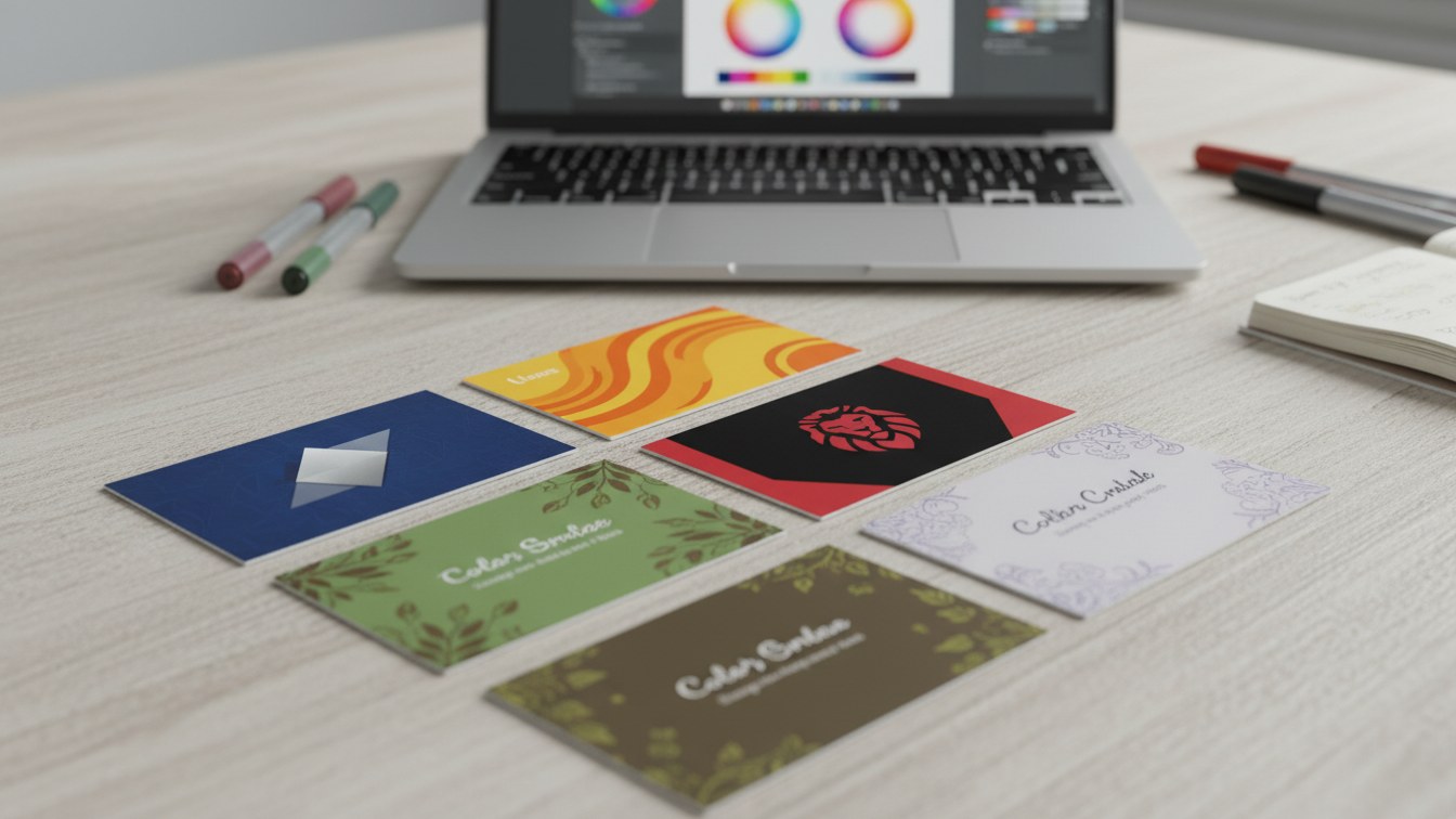
The Importance of Business Card Design
Your business card serves as a tangible representation of your brand, making it essential that it communicates the right message at first glance. Effective business card design not only showcases your contact information but also reflects your company’s identity. One of the most crucial aspects of this design is color selection, deeply intertwined with color psychology.
Understanding Color Psychology
Color psychology is the study of how colors affect perceptions and behaviors. Different colors evoke various emotions and associations, influencing how your audience views your brand. Here are some popular colors and their meanings:
- Blue: Trust, dependability, and stability.
- Red: Passion, urgency, and action.
- Green: Growth, health, and tranquility.
- Yellow: Optimism, clarity, and warmth.
- Purple: Creativity, luxury, and ambition.
Creating Psychological Connections
By understanding the emotional triggers associated with different colors, you can strategically design business cards that resonate with your target audience. For instance, a financial consultant might use blue to convey trustworthiness, while a wellness coach might opt for green to communicate harmony and growth.
Aligning Colors with Brand Identity
Your choice of color should align with your overall brand identity. Consistency in color scheme across all brand touchpoints enhances recognition and strengthens your brand presence. Here’s how you can ensure that your business card colors are aligned with your brand:
- Identify your brand's core values and mission.
- Choose colors that reflect these values.
- Consider your industry norms to remain relatable to your audience.
Execution by Our Team
When you choose to work with us for business card design, our skilled team will guide you through the process of selecting impactful colors that align with your brand and its values. We execute designs that embody the essence of your business, ensuring that your business card is not just informative but also inspires emotional connections.
Common Mistakes in Business Card Color Choices
To achieve the desired emotional response, it’s crucial to avoid common pitfalls when selecting colors for your business card design:
- Overuse of vibrant colors can overwhelm the viewer.
- Lack of contrast may make the information hard to read.
- Using colors that don't align with your brand can confuse your audience.
Final Thoughts
In conclusion, color psychology is a vital element of business card design that can significantly affect how your brand is perceived. Investing in a thoughtfully designed business card can enhance your marketing efforts and foster meaningful interactions with potential clients. If you’re ready to elevate your brand’s first impression, contact us today!